About our logo
About our logo
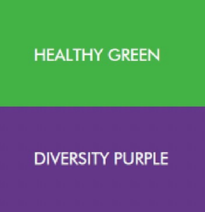
The colours of “Healthy Green” and “Diversity Purple” in our logo align with our purpose of working together for a healthier Elgin. We are shaping the care system so people feel welcome, safe, and dignified.
The arch in our logo represents inclusivity and an intention to bridge gaps in health care services and accessibility. We are committed to collaboration and meaningful engagement to help people connect to the health care and support services they need. This includes embracing the unique cultural needs and traditions of all members of our community, such as our Indigenous and Low German communities.
The arch in Elgin OHT’s logo also represents the critical role Elgin’s heritage railways played in the history and development of the region. The connections provided by railways brought economic prosperity, improved transportation, and contributed to the growth of communities.
Building on these themes, Elgin OHT partners are working together to bridge our current health care system to one that is a better and more coordinated system of care in our community.